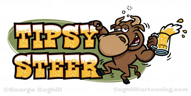
With a restaurant name like “Tipsy Steer”, the logo kind of draws itself. The client approached me with the superb idea of the bull keeping his balance on the lettering. This one was pretty close to final from the first sketch, more a matter of making it all just right. The client loved it.
