After an engaging exchange on Twitter with illustrators: Garth Bruner and Von “Vonster” Glitschka, who are constantly Twittering about their frustrations with being forced to switch from Freehand to Illustrator after Adobe’s acquisition of Macromedia, things reached the point where all involved thought that we need a way to band together and get some feature requests implemented in the next version of Adobe Illustrator.
Software
Essential Adobe Illustrator Plug-in: Select Menu
A plugin that I always forget to tout, since the functionality it provides seems so intrinsic to Illustrator once it’s installed, I forget it’s a third-party enhancement.
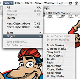
Select Menu for Adobe Illustrator (Mac and Windows, free) from Graffix Software is available for every version of Illustrator from 8 on up to CS3. It adds additional selectable items under the Select -> Objects menu.
This plugin really comes in handy at the production stage of prepping your art, allowing you to find all sorts of items that you need to preflight. It especially comes in handy after flattening transparency, such as when you export art to an older version of Illustrator. I find lots of klunky and open paths all over the place after flattening transparency, and I couldn’t imagine how much of a pain in the neck it would be to clean up art without Select Menu.
Wacom Bamboo Graphics Tablet: Nice Entry-Level Tool, But Limited
I recently had the opportunity to try out a Wacom Bamboo graphics tablet, having purchased one for my Dad this holiday season. Dad is not a graphics guy by any means, but I use my Wacom tablets for so much more than just drawing and graphics applications – and love it so much – that I thought the Bamboo was a perfect accessory for another ardent computer geek.
In short, the Bamboo is a great entry-level tablet for casual users, but graphic artists will want to seriously consider investing in one of the pricier, but more fully-featured Intuos3 models. Read on for full details.
Color Blindness Software Tools for Artists
Just stumbled across these handy Mac OS X software applications to help designers and artists simulate the effects of color blindness on-screen: Sim Daltonism and Color Oracle.
Sim Daltonism works as a floating palette which converts an area under your mouse cursor to the selected type of color blindness — it works similar to the Apple Digital Color Meter sampling utility. There are 8 different types of color blindness to test. Color Oracle works as a menubar item which converts the entire monitor to the selected mode of color blindness, but only offers the three most common forms.
Default Folder X – Essential Mac Productivity Utility Software
Default Folder X is one of those shareware utility applications that seem pretty handy while you are demoing, but until you use another Mac without Default Folder installed (or the demo runs out), you don’t realize exactly how perfect the software actually is.
I constantly run across these “714 Absolutely Essential Mac Applications” blog posts that always leave this one out. And I think the only reason is that the author is unaware of it’s existence. There’s no other explanation. Half of the time the apps I see on those lists are so-so anyways.
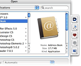
So what is this so-called “Default Folder” anyways? In short, it’s a way for you to access — from the Open/Save dialog windows — not only commonly used folders, but also recently used folders and open Finder windows, all with (mostly) user-defined keyboard shortcuts.
Productivity Tip: Floating, Transparent Reference Images Using Screenshots & Free Software Afloat
Ever need to temporarily reference another document while working on something – this may be an image, or instructions, or a PDF file. Many times you want it floating right on top of your current document so you can refer to it while you are working, and not have to switch back and forth between applications.

I do this a lot when working in Illustrator, especially working from reference images, but also the occasional email message or PDF file sent by a client.
Color Theory Resources
Primary, secondary, tertiary, complimentary, analagous, brightness, hue, value, saturation, tints, shades… do these words mean anything to you? They should.
A post by cartoonist Matt Glover points out ColorFAQ – very basic web guide to color theory. It got me poking around on the internet for some other sites with some more depth on the subject. Sometimes I forget how much I use color theory every single day, it’s just something that sometimes goes on autopilot and is an easy topic to forget to recommend to others.
Content Aware Image Resizing – Video of New Computer Graphics Technology
This one is hard to explain without watching the YouTube video over at Creative Bits: Content Aware Image Resizing
The video is a demonstration/presentation from the annual SIGGRAPH (Special Interest Group on GRAPHics and Interactive Techniques) Conference. In short, the video demonstrates computer algorithms which allow an image to be resized horizontally or vertically non-proportionally, without distorting the image. Elements are “reshuffled” inside the image to keep the same basic look of the visual information.
Very interesting.
Tip: Increase Productivity Using Adobe Illustrator’s Layer Masks
The excellent Illustrator blog BittBox has a nice Adobe Illustrator Layer Mask tip/walkthough on how to use this highly useful, productivity-enhancing (and fairly obscure) feature of Illustrator CS and higher.
Layer Masks are basically clipping masks that apply to the entire layer (Layer masks need to be sub-layers, and the top-most one at that). The best feature is that they can be locked, and they are not tied to one specific object, or cause an entire group of unrelated objects to become “grouped” as they are when applying a clipping mask to them. This allows you to work normally with all the other objects on other sub-layers while still getting that clipping mask effect.
Head on over to BittBox and read the full post: Improve Your Illustrator Workflow with Layer Masking