A great quick tip, from the excellent design blog BittBox, to create a color group of all the colors in an Illustrator document: Select all the art in your document, go to the Swatches fly-out menu and choose “New color group” – you now have a color group folder of all the colors in the artwork. Very cool!
Since color groups are a CS3 feature, this tip is Illustrator CS3 only.
A cartoon illustration & design project for a friend’s party required the resulting art to be suitable for reproduction on a photocopy machine. After some trial, error, Google search, trial, error, Google search, trial, error I discovered the magic combo that allows you to create a halftone in Photoshop for an image and print it out on your inkjet printer so the art will be perfect for photocopying.
This technique is perfect for flyers, newsletters or any other short-run printing needs you have where the cheapness of a photocopy is desired, but so are grayscale images.
I recently updated the “Girl in the Moon” artwork (while drinking some Miller High Life beers, of course). I had initially created a version of her a few years back, and while I thought it was good at the time, lately I have been wanting to update her as she was my first attempt at a pinup style illustration. I have been working towards a certain look/style for the pinup girls, including some devil girl pinup art and others and felt I was getting closer to that vision as of late.
I thought it only fair to go back and update the original. A request to get that original art in t-shirt format prompted me to start work on the new version.
Default Folder X is one of those shareware utility applications that seem pretty handy while you are demoing, but until you use another Mac without Default Folder installed (or the demo runs out), you don’t realize exactly how perfect the software actually is.
I constantly run across these “714 Absolutely Essential Mac Applications” blog posts that always leave this one out. And I think the only reason is that the author is unaware of it’s existence. There’s no other explanation. Half of the time the apps I see on those lists are so-so anyways.
So what is this so-called “Default Folder” anyways? In short, it’s a way for you to access — from the Open/Save dialog windows — not only commonly used folders, but also recently used folders and open Finder windows, all with (mostly) user-defined keyboard shortcuts.
I just posted this SCUBA dive flag t-shirt design up on Zazzle. I was going through some of my archives and had forgotten about this one. I came up with this after taking a camping trip to the Florida Keys (the Bahia Honda Key in particular) a few years ago.
The campsites are right on the beach (with electricity even!), and it’s one of the few areas in the world where snorkeling can be done right from the shore. The entire group brought snorkeling gear “just in case”, but we all found ourselves instant snorkeling enthusiasts from day one. From the outside, it seems kinda boring. When you are actually doing it, it’s inexplicably awesome. Since the creative gears are always crankin’, I ended up working up some sketches for t-shirt ideas and when this one popped up, I knew I had a winner. And then I promptly filed it away and lost track of it for three years!
If you aren’t familiar with cartoonist Tom Richmond, make yourself familiar. This guy’s work is absolutely amazing. Very much in the style of Mort Drucker from MAD Magazine — only taken to the extreme. Not only is his cartooning & caricature style excellent, but his color work is also phenomenal. Tom graciously has taken the time to outline exactly how he digitally colors his artwork in Photoshop in a juicily-detailed three-post tutorial/how-to series on his cartooning blog.
Primary, secondary, tertiary, complimentary, analagous, brightness, hue, value, saturation, tints, shades… do these words mean anything to you? They should.
A post by cartoonist Matt Glover points out ColorFAQ – very basic web guide to color theory. It got me poking around on the internet for some other sites with some more depth on the subject. Sometimes I forget how much I use color theory every single day, it’s just something that sometimes goes on autopilot and is an easy topic to forget to recommend to others.
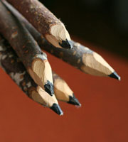
I touched on the awesomeness of using multiple pencil grades in a previous post on essential cartoonist tools before, but there’s a great overview specifically on pencil grades by cartoonist Matt Glover. There’s some decent additional pencil grade classification information over at Wikipedia as well.
Find out what those cryptic “2B”, “HB”, “6H” and the rest really mean. Knowing the difference, having a full set of pencils with all the grades in the range is a must. This is the way to lay down very thick, dark blacks in your drawings as well as fine, light grays. It’s all in the blackness and hardness my friends.
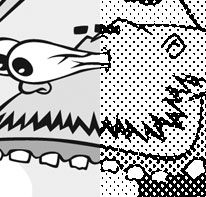
 A cartoon illustration & design project for a friend’s party required the resulting art to be suitable for reproduction on a photocopy machine. After some trial, error, Google search, trial, error, Google search, trial, error I discovered the magic combo that allows you to create a halftone in Photoshop for an image and print it out on your inkjet printer so the art will be perfect for photocopying.
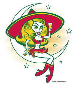
 I recently updated the “

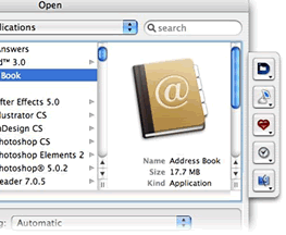
 Default Folder X
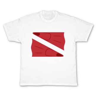
 I just posted this
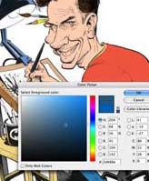
 If you aren’t familiar with

 I touched on the awesomeness of using multiple pencil grades in a previous post on