 A cartoon illustration & design project for a friend’s party required the resulting art to be suitable for reproduction on a photocopy machine. After some trial, error, Google search, trial, error, Google search, trial, error I discovered the magic combo that allows you to create a halftone in Photoshop for an image and print it out on your inkjet printer so the art will be perfect for photocopying.
This technique is perfect for flyers, newsletters or any other short-run printing needs you have where the cheapness of a photocopy is desired, but so are grayscale images.
The biggest problem I ran into was the fact that an inkjet printer just doesn’t print crisp enough dots on regular ol’ inkjet paper. Too small and the halftoning just blends together. Too big and it just looks like crap.
Oh, yeah – what is halftoning anyway? Halftones allow one to keep an image in black and white, but also mimic ranges of grays, gradient and tones. this is done by converting the art to many small dots of varying diameter (bigger for darker, smaller for lighter) which, when viewed from a normal distance, optically “mix” and create the illusion of grayscale. It’s quite cool, and you see it all over the place — almost anywhere you see commercially printed images that have gradients, blends or photographic imagery. Newspapers & magazines are the best place to see examples. Look real close and you’ll see the images are actually made up of very small dots. Color images just use 4 screens (halftone screens) which are printed on top of each other with the overall angles of the dots for each color screen slightly varied (this is the CMYK halftone printing method). And go check out the halftone entry at Wikipedia for in-depth information as well.
If I had a fancy-schmancy laser printer, or wasn’t pressed for time and was able to take the file to a printing service to get a laser master printed, this might not be necessary. Haven’t tried it yet. Laser printers will print much crisper detail and most likely allow for finer halftoning dots. In my case I didn’t have that luxury. And you are also limited by the resolution (or screen?) of the photocopier. Anyways…
First, open your image in Photoshop. In my case I was starting with a cartoon created in Adobe Illustrator. I just opened the AI file in Photoshop, allowed it to rasterize the image at 200 dpi. Then you want to:
• Flatten the image (if it’s not flattened)
• Convert to Grayscale (Image -> Mode -> Grayscale). Images need to be grayscale in order to be converted to bitmaps.
• Convert to Bitmap (Image -> Mode -> Bitmap…) with the Output resolution at at 200 pixels/inch.
› For “Method” choose “Halftone Screen…” in the drop-down menu, which will open yet another dialog box (YADB?) once you click “OK”. This opens up the Halftone Screen settings. Here, enter 40 as the lines/inch setting, and keep the default 45 degrees for the halftone angle.
That’s it! Once you click OK, your image will be a halftone, and will be suitable for photocopying in all it’s grayscale goodness.
If using type in your design, I suggest you then place your halftoned image into Adobe Illustrator or Adobe InDesign and add your text there (and keep it all solid black). Halftoning type makes it look fuzzy, and at this coarse halftone screen, small lettering will just become illegible.
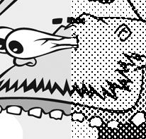
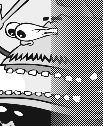
Trust me when I tell you that no other combo of settings will produce a file where the halftone dots print as distinct dots on an inkjet printer. The result, seen here, is pretty darn good and photocopies excellently:
Update: James Dempsey over at the Creative Guy blog has a technique to create the halftones right in Illustrator. I haven’t tried this out yet so I don’t know how the settings need to be for the output to work properly with a photocopier.