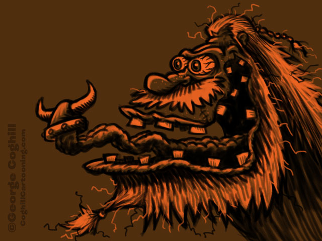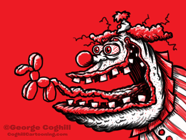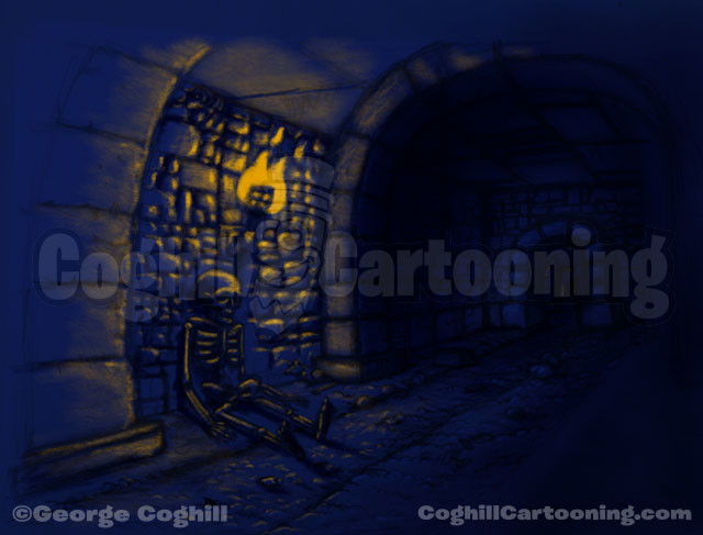
Skeleton Dungeon Limited Palette Sketch



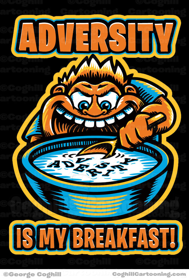

This t-shirt illustration was created for the Cleveland Metropolitan School District for a student campaign they were running. The odd color choices were used as they were the branding colors for the campaign.
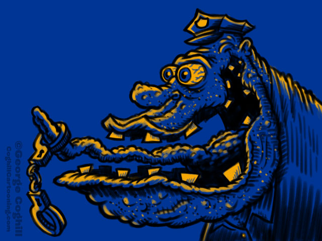
This illustration was intended for a black t-shirt, with just 4 colors being used for the printing (blue, yellow, orange and white). Continue reading
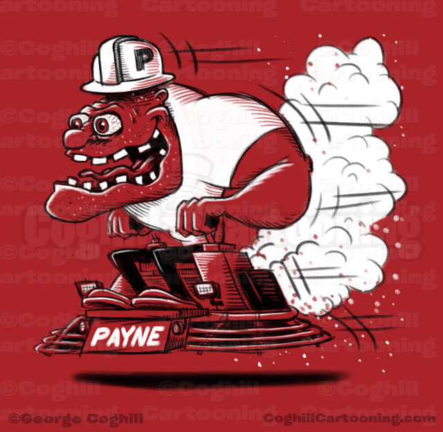

Limited palette sketch for a t-shirt illustration project. The client requested a concrete riding trowel with a character riding it like a hot rod. I went with the classic hot rod goon approach to the character and a fun, loose style to the line art.
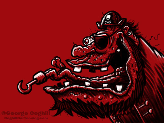
I went with a limited palette to keep the screen printing costs down (just 2 inks used here, black and white on a red shirt). I’ve had a lot of fun working with these reduced color drawings lately, and I find they help focus and tighten up the art. They also just look super cool with less colors!
This project never went past the sketch stage, the client went MIA on me but I really liked this sketch and had to share it.
