Cowboys Hound


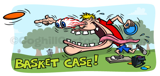

“Basket Case” is a new t-shirt illustration design I created featuring a wild-eyed disc golfer cartoon character in the Kustom Kulture/Odd Rods/Ed “Big Daddy” Roth style — complete with veined eyes bulging out of the head, a wild and crazy grin with an exaggerated, wagging tongue dragging out of the mouth.
Available for purchase — and customization — over at Zazzle. Click here to get yours now!
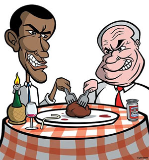
A recent Obama & McCain humorous cartoon illustration I created for Time Out NY for the “Commander In Beef” article regarding what New York City chefs would prepare for the 2008 presidential candidates. The illustration was created for the dining section, and is currently being featured on the front page of the Time Out NY website’s dining section. The featured artwork is a spot illustration companion piece to the full page illustration I created for the print article:
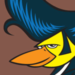
 I just finished up a t-shirt illustration – ‘The Hairy Canary‘ – for mail-order/catalog company What On Earth for their pub t-shirts line.
The basic premise of the t-shirt designs are as follows: the artist is given a choice of bar/pub names to choose from, and from there a design is worked up to go with the name. I believe all the bars & pubs are actual places, but these aren’t officially sanctioned or anything.
From the list I was given, the name ‘Hairy Canary’ just jumped out at me and I knew it was a theme that would spark a cool illustration.

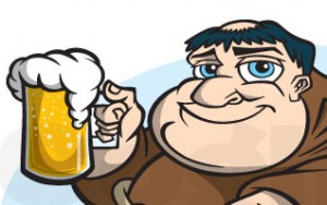 I recently finished up this ‘Theology On Tap’ cartoon character mascot/logo project for a youth ministries client.
The client is a youth ministries minister, and his new program is focused on bringing discussions of theological matters into more casual settings to try and reach additional young people.
The artwork is intended to be used on various advertising and promotional materials, as well as a t-shirt design.
I thought it odd at first, but I suppose there’s nothing really wrong about talking about religious matters in a bar, right? And I suppose a minister knows the deal. My only concern was to create a great illustration for him and his project.
Anyways, read on for an in-depth overview of the process to create this cartoon character mascot/logo from start to finish, including unused sketches created along the way.

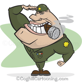 A recent project, “Major Change” was developed for a Canadian client looking for a cartoon character mascot for a promotional campaign. Interestingly enough although it was a Canadian client, they preferred to go with a United States military officer for the iconic quality. Kind of a bummer to think that when people think “military”, they think “United States”. I guess for some people that’s a positive thing. And before this post gets too political…
For some reason I had it in my mind from the initial discussions that somehow the character was to be a gruff bulldog chomping on a cigar, General Patton-style. The cigar remained, but I was set straight on the proper direction early on. Another reason to make sure you have plenty of dialog with your client before starting projects.
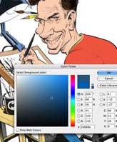
 If you aren’t familiar with cartoonist Tom Richmond, make yourself familiar. This guy’s work is absolutely amazing. Very much in the style of Mort Drucker from MAD Magazine — only taken to the extreme. Not only is his cartooning & caricature style excellent, but his color work is also phenomenal. Tom graciously has taken the time to outline exactly how he digitally colors his artwork in Photoshop in a juicily-detailed three-post tutorial/how-to series on his cartooning blog.
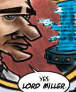
 I (very) recently worked on a two-page spread illustration for the Cleveland Free Times issue that comes out this week (Wed. Aug. 15, 2007). The piece was a satire on the controversial Cleveland Clinic “Medical Mart” being proposed in Cleveland, Ohio.
Writer James Renner found my work via my website and wanted me to illustrate his Star Wars themed parody of the shenanigans. The piece was done in a cartoon style (obviously) reminiscent of MAD Magazine, as I was flexing some serious Mort Drucker, Sam Viviano & Jack Davis idolisation while creating the piece.
Staff writer Renner, along with Editor Frank Lewis were extremely pleased with the final piece, which was created on a super-tight deadline (even after being given a requested week’s bump by Art Director Ron Kretsch due to many existing and pressing projects on my end).