This t-shirt design was created for the 2009 Ohio Canal Corridor‘s annual River Sweep event. The Ohio Canal Corridor exists to create a park system that follows the route of the historic Ohio Canal. River Sweep is an annual volunteer cleanup event, and part of the gift package that volunteers receive is a t-shirt. I have been working with the Ohio Canal Corridor for a few years now designing the -t-shirts.
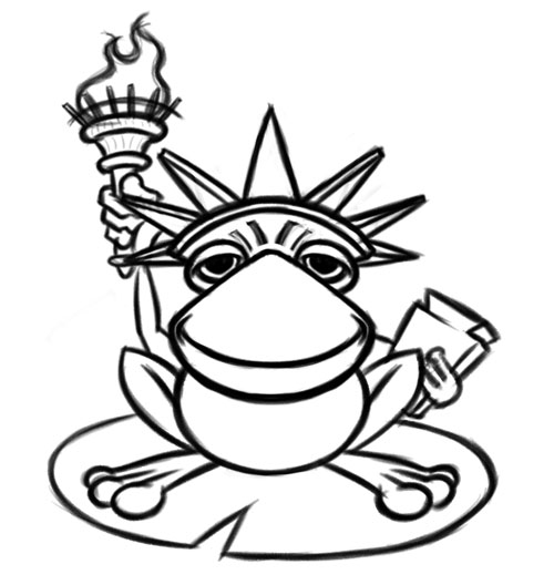
The initial sketch started out in a much different direction, as seen below. I was thinking much more frog than Statue of Liberty, and the client had more Statue of Liberty in mind with some frog elements. The frog is the mascot of the River Sweep event, and the ongoing theme is to work a frog into various famous paintings such as the Mona Lisa and American Gothic (some past themes we created for the t-shirts).
 Back to the drawing board, with a new rough sketch of the Statue of Liberty as the focus. The client also wanted to include elements of a burning river, a small poke at the history of the Cuyahoga River catching on fire some tears ago (it’s much better now).
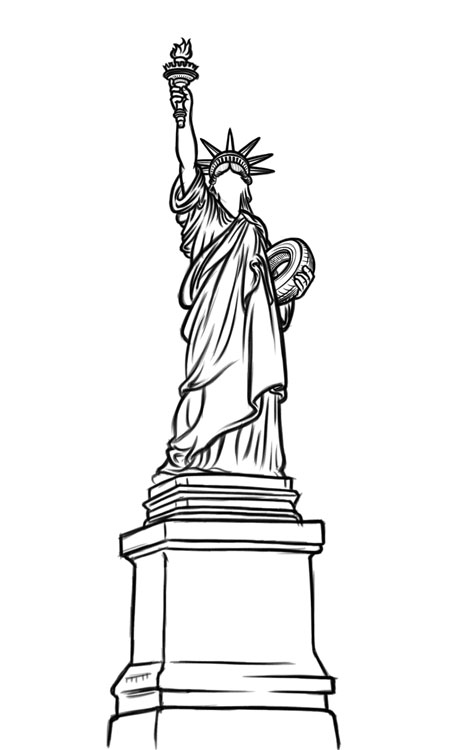
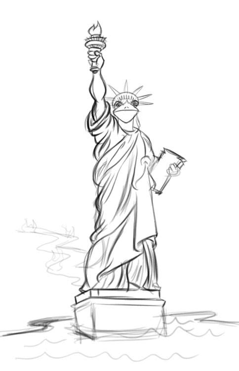 The client approved this rough sketch, so I went to work creating the final line art sketch. I knew I wanted to go with a clean-line illustrated quality for this one, as opposed to a more cartoon-style approach. I felt it would read better as the Statue of Liberty if the illustration were more formal, allowing the frog element to work better. Below is the working sketch for the line art. Created using a Wacom graphics tablet and Adobe Photoshop.
You can see we added a tire to swap out the tablet in Liberty’s arm—a small joke to reflect the “cleanup” aspect of River Sweep. Nice suggestion from the client.
At this point I left the frog face blank, as I wanted this to read as the Statue of Liberty first, and then match the style of the frog face to the existing line art.
Once the Statue’s line art was complete, I added the face of the frog. The face is a bit exaggerated as far as size, as I wanted it to read well.
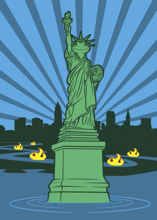
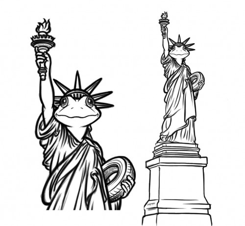 This artwork was approved and I went to the vector art stage in Adobe Illustrator. Once all the line art was complete, I started working with the background elements. Being a screenprinted t-shirt design, one must take into account the limited number of colors available to print. In this case, we were looking to stay at around 4 or 5 colors.
My initial design is below.
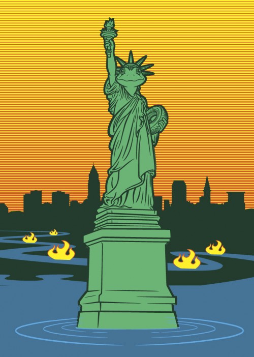
The client loved the overall look of the design, but wanted more color. I experimented with variations on the sky, using the red and yellow already present in the flames.
The above approach was intended to minimize the impact of the red and yellow so it didn’t take too much attention away from the focus of the frog/Statur of Liberty. As I expected, the client asked to see a red and yellow version with the expanding rays from the initial design.
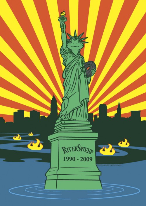
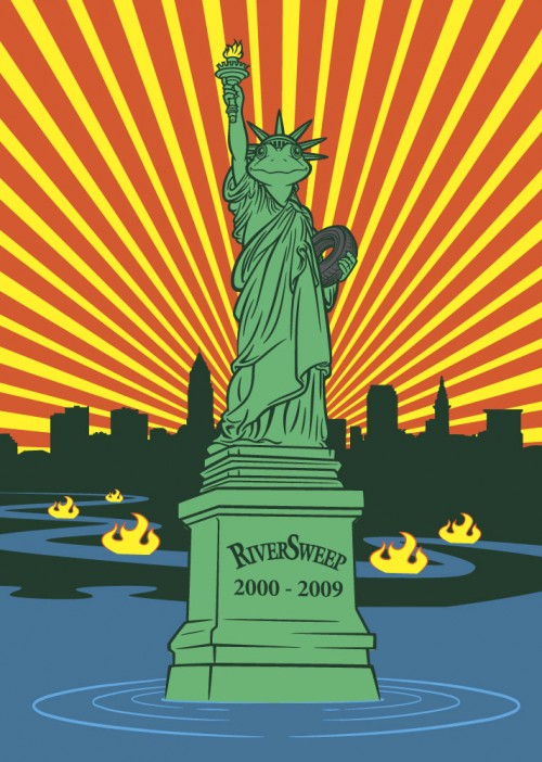
Above is the revised design, with some tweaks to the rays; I increased the number of them, but we all agreed it was a bit busy. The red and yellow rays were definitely how the client wanted to proceed.
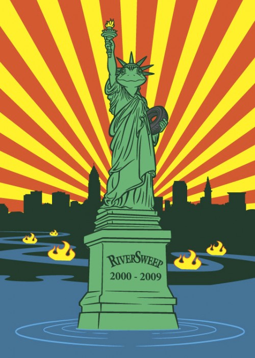
Above is the final design, the rays spaced out a bit more. I think in the end, considering the limited color palette we had to work with, that this final design worked out great.
Looks great. I love the lines on the statue’s gown, those are hard to do. The balance between white space and lines is tough, you pulled it off very well.
Thanks Brad. Yeah I find with this type of illustration, the biggest hurdle is determining what to keep and what to leave out so that it reads well, but isn’t too cluttered.