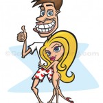
 “Average Joe” is a recent cartoon character mascot I created for a client. The project specs were pretty straightforward – two cartoon characters, one being “Average Joe” who would become the company mascot, and for this particular illustration he would need a sexy cartoon woman wrapped around him.
This project had a very tight deadline, so I got to work immediately on the sketches. The initial rough sketch was created to get the general idea down and to start the conversation. Being a tight deadline, I sent out a sketch that normally I would have refined a bit before sending. In this case, I needed immediate feedback on the direction so I sent this rough concept to get the client’s OK on the overall posing of the characters and the general look.
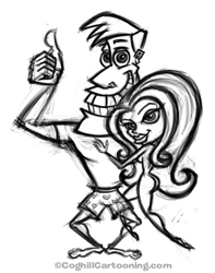 Sometimes my male and female character styles don’t match up, body-wise. I have this exaggerated style I use for male characters that usually involved tapering down from a large head & shoulders to some goofy legs. When paired with a female character, who are usually more proportional body-wise, there’s not always a match. This initial rough sketch worked fairly well, although there are some internally inconsistent proportions that I would have edited regardless. In particular, the “thumbs up” hand & arm are not quite right.
In this particular case, the client’s response — which I agreed with — was that the head was too “cool”; we needed a more geeky “Joe”. Tweaking the head required a reworking of the body, for the reasons mentioned above. So back to the proverbial drawing board.
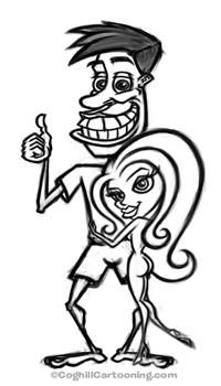
The revised sketch at left is the new version of the mascot. For the most part, the sexy woman remained as she was from the first sketch, changing her legs to make her less ‘floating’. I had delusions of Frank Frazetta & Boris Vallejo Conan covers in mind, but without the requisite mountaintop rocks & lightning bolts, it wasn’t working as planned.
Joe also got some revisons, most obviously to the head & face. He was given a more goofy, broad grin, and the overall body was revised to give him a more nerdy, skinny body as well.
At this stage the client was pretty much pleased with the sketch as-is, but I had mentioned that perhaps Joe was a bit too goofy, and maybe we should try to work up a new head that also matched a bit more with the woman’s head & face. The client agreed, with the caveat that we were fast approaching the deadline so we’d need to be able to fall back on this version if we weren’t able to get a new look for the head that improved that we had so far. The client agreed on this and I went to work on some revised heads for Joe.
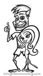 This new sketch I thought hit the nail on the head — goofy without too goofy, much better matched the style of the sexy woman, and overall seemed more in proportion to the body. I emailed this late-night to the client and went to bed smug in the knowledge that I had reached the perfect “Joe”.
But alas, it was not to be; while the client shared my preference for the new Joe, his colleagues opted for the previous version. Such is the case in these types of jobs, and one needs to be flexible. The way I avoid disappointment is to never send a sketch that I am not in some way pleased with. While some may not be my first choice, I send nothing that I think is “just OK”, or couldn’t with some work be a viable alternative.
At any rate, I had already started working on the vector art for the body and for the woman, as we knew these would not change. I tend to create most — and for sure the more complex illustrations — in layers and discrete elements so that I can isolate and tweak individually the multiple parts. Heads & bodies are almost always created as separate vector elements, since sometime a small tweak in the proportions of the head/body ration can make all the difference in the world. This also helps with positioning and eliminating tension areas in the design. Even within one element such as the head, I will create all the parts of the face as separate vector objects so they can be resized, moved and rotated independently of each other to get everything just right. I do my best to keep the art at the vector stage as flexible and open as possible to allow for revising the details.
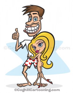 With the bulk of the rough vectors laid down, and the final look of “Joe” apporved, I went back into the Illustrator file and created the vector paths for the head. Color was applied, the hearts on the boxer shorts added, and shading applied.
I actually like the way the chosen “Joe” head looks when in color, but I am still curious as to how the head sketch I preferred would have looked when in color. I should probably work up the vector art just to satisfy my curiosity, but at this point in time I have enough on the plate to occupy my time.
Rough sketches were done pencil-on-paper and scanned into Photoshop, with all revisions on fine-tuning done in Photoshop CS3 using my Wacom Intuos3 graphics tablet. Final vector art was created using Adobe Illustrator CS3 and the Wacom tablet.
thats a great little sexy girl in the cartoon, nice blog.
Thanks for the kudos Nick!
i really like the way you draw. ive been thinking about starting a cartoon and your drawings are exactly what i wanted my characters to look like. very good work :D
Thanks Holli, and good luck on your artwork. If I can answer any questions, feel free to drop me a line.
Wow what a nice ass….JK!!!!!!! u guys are perves!!!!!!!!!!!!!!!
nice pic who ever came up with it
iukl;’
lol ya nice woman!! lol sexy