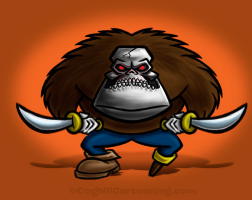
Cap’n Clobber is my robot gorilla pirate creation for this week’s Monster Monday illustration.
This entire drawing was created using Photoshop CS4 and a Wacom Intuos3 graphics tablet. The initial rough sketch was worked up as I was fishing for ideas for this week’s creature.
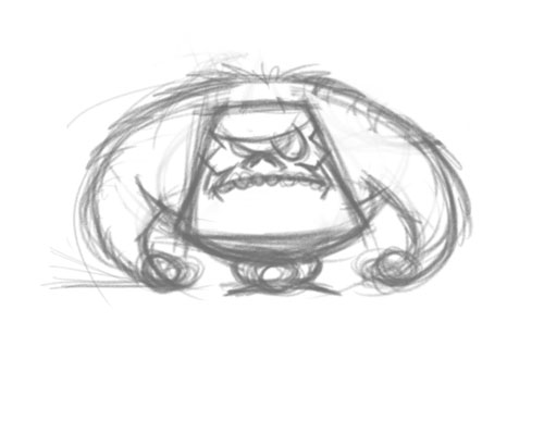 You can see he’s quite different from the final artwork. At this stage I was just working up an overall look and proportions for what I thought the character should look like. I took this rough concept sketch, dropped the layer’s opacity and started working on refinements:
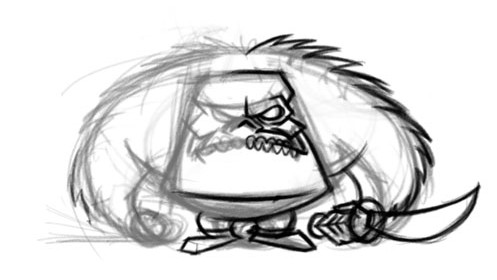 The details on the skull were fleshed out (no pun intended), and the hand and sword were added.
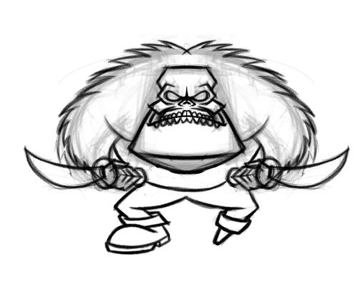 This next sketch has a dramatic change in the overall body proportions. Once I realized I was going to give him pirate props, I needed to have more definition in the leg area for the details. The sketch refinement layer was duplicated and flipped, and the legs added.
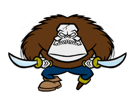 The line work was then cleaned up some more, and then a new layer added below the line art layer for the flat color.
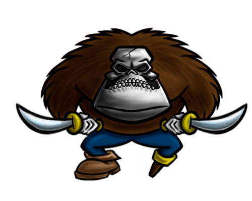 Next, a shading layer was added above the flat color area. This layer is set to the Multiply blend mode. A highlights layer was also added, with it’s blend mode set to Screen. I jump between these two layers as I am working — in other words the shadows layer is not done in one pass and then the highlights, but rather I will work on both simultaneously going back and forth as I refine the details.
 At some point the red glowing eyes came to mind, and these were added as well.
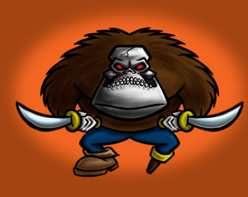 A simple flat color background layer is then added, and then a flat oval of a brighter tint of the same color is added to a new layer. A gaussian blur is applied to this oval layer.
Final step is to add the shadow. For this illustration I experimented with a shadow created from the actual character artwork. This was done using the “Copy Merged” menu item as it will use all visible layers for the selection, not just the highlighted/active layer.
I pasted my “merged copy” into a new layer, used the Magic Wand tool to select the areas outside the character and then inverted my selection. I then filled it with black by using the Option-Delete key combo (fills with the foreground color). Had I remembered, I could have used the Option-Shift-Delete combo, which only fills the non-transparent pixels with the foreground color. Swap the Command key with the Option key to do the same with the background color.
The layer was then distorted using the Transform command, and then squashing the height as well as a small bit of foreshortening (Command-Option-Shift click one of the top-most control handles when in Transform mode to achieve the foreshortening).
I then set this layer to multiply, and reduced the layer’s opacity to 60%. I then duplicated the layer. One version was given a Gaussian blur, and the other had a Layer Mask applied using a gradient to feather it out as it receded, letting the blurred copy take over.
Requisite copyright notice was then embedded in the image, and the artwork is complete.

Great Character George! I love the concept.
Thanks Joel!