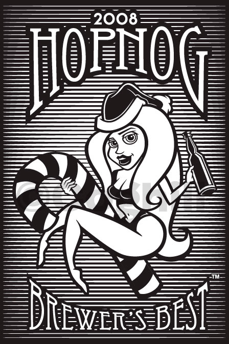
I recently created this pinup Santa girl illustration for a local company that produces home-brewing beer kits. The client was developing a special holiday/Christmas blend, and wanted to also include an incentive in the package — in this case it was to be an empty 24 oz. beer bottle with a pinup Santa girl silkscreened on to the bottle.
The artwork was first sketched out so we could get the look of the girl down. My instructions from the client were to be quite risqué with the art, as they have a predominant 20-30 year old male age range as a demographic.
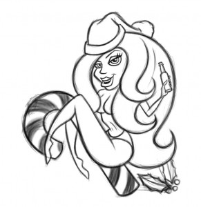
My initial sketch was rejected for being a bit too risqué — they didn’t want the suggestion of her being nude, and thought the girl was a bit too sexy when they were going for more of a cute pixie look for the pinup babe.
I have to agree that the final art is much better and more appropriate for the bottle. The original sketch has her maybe a bit too trashy!
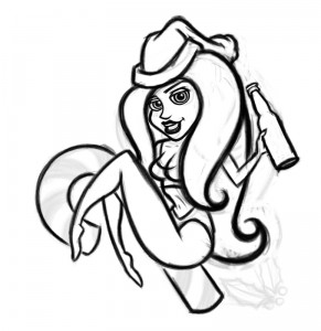 So back to the drawing board I went, and worked up a new sketch based off of the original overall look of the first — the client liked the general direction, but wanted to change the look of the girl.
You can see from both of these sketches that even at the rough stage, I work pretty detailed. I tend to work out ideas within a drawing, as opposed to coming up with a bunch of half-assed variations for the sake of having variations.
Usually this rough concept sketch is the culmination of 5 or 6 individual sketches as I work out what is successful and what is not.
For this revised sketch, I just dropped the opacity of the original down and worked on the revisions on a new Photoshop layer. If you look carefully, you’ll notice the positioning of her legs as well as the canday cane has changed from this rough sketch to the final. It looked more natural and the design flowed better to have the space opened up.
This rough sketch was then cleaned up even further in Photoshop, where it was then placed into Adobe Illustrator as a template layer. There was very little question about the quality of the line work at this stage, which helps the vector creation process go much more quickly.
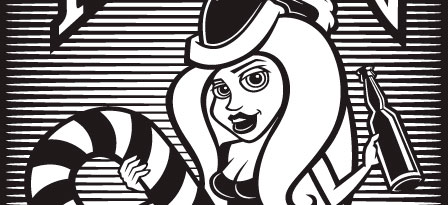
One thing that had to be addressed was the handling of the dark areas so that they weren’t lost when they met the outlines. Also, the consideration of the overall rhythm of the light and dark areas was a concern. I knew I was going to be adding a pattern to the background so I could keep the dark outlines. The bottle is actually an amber brown, and the ink printed is white, so this played a part in the overall design considerations.
The background is just a simple tapered line which was duplicated and then both lines were combined as a blend, which allowed me to easily control the number of lines and the spacing until I got it just right. Too thick and it would overpower the linework of the main art; too thin and it would get muddy when screenprinted.
The lettering was also created in Illustrator, and hand-arched using the Envelope Warp tool. I don’t have the fancy plugins that make this easier (and are worth it) so I had to make do with what I had. Illustrator’s built-in Arch warp just doesn’t do the trick. Try it for yourself and you’ll see the warping doesn’t keep the vertical lines straight, and it ends up looking like crap.
The back of the bottle also was part of the project, and it really is not much more than a repurposing of the lettering from the front with an oval with design flourishes to give it that “beer label” look.
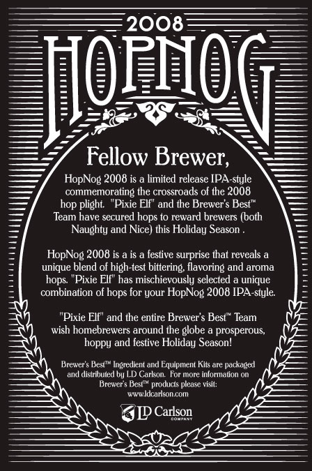
The “barley” wrapping the bottom half was hand-created (again using the Blend tool for the diminishing shapes) and then the blend was expanded and the resulting barley grains were then made into a custom Art Brush so I could smoothly wrap them on the oval — the oval was copied/pasted in place, then divided up to leave just the arcs I needed, to which the “Barley brush” was applied.
Unfortunately I have not seen the final product, even though it was requested from and promised by the client. I dropped a line recently but have not heard back. I was looking forward to having one of these in the studio, but I guess it’s not going to happen.
This artwork was actually created over the summer, but per the client’s request I have not posted it until now as they wanted it to be hush-hush in case their competitors were checking up on them.
Hope you enjoyed this artwork as well as the work behind the scenes that went into creating it.
