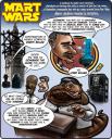
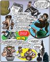
 I (very) recently worked on a two-page spread illustration for the Cleveland Free Times issue that comes out this week (Wed. Aug. 15, 2007). The piece was a satire on the controversial Cleveland Clinic “Medical Mart” being proposed in Cleveland, Ohio.
Writer James Renner found my work via my website and wanted me to illustrate his Star Wars themed parody of the shenanigans. The piece was done in a cartoon style (obviously) reminiscent of MAD Magazine, as I was flexing some serious Mort Drucker, Sam Viviano & Jack Davis idolisation while creating the piece.
Staff writer Renner, along with Editor Frank Lewis were extremely pleased with the final piece, which was created on a super-tight deadline (even after being given a requested week’s bump by Art Director Ron Kretsch due to many existing and pressing projects on my end).
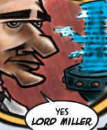
The piece parodies Sam Miller (as Darth Miller), Toby Cosgrove, Tim Hagan, Peter Lawson Jones, Chris Kennedy, Jimmy DiMora (as Jabba DiMora), the Terminal Tower as the in-construction Death Star, and of course R2-D2 as the faulty Diebold voting machines (bonus points if you catch my “R2-Diebold” Drucker-esque gag in the art). Each of the local politicians/councilmen/CEOs etc. had to be caricatured, and I went for more of a “cartoon-ification” of them than actual caricatures. I was pretty pleased with the results, as it kept the art in my style while still satirizing the locals.
On the technical side, the illustrations were first hand sketch (very roughly) and then scanned and finished roughs of the sketch were created in a layered Photoshop file. Color was then added digitally, and elements sized and tweaked to fit the layout. The art was then brought into Illustrator for all the title and text treatment, as well as the comic speech balloons (all balloon text was a comic book style font called “A.C.M.E. Explosive!” by Blambot Fonts). A bunch of back and forth from Illustrator to Photoshop to tweak everything just right, and then a final PDF was output for printing.
This was an especially challenging project as I am not a comic book guy. Developing the comic style was easy, but constructing the page and putting it all together was tough work for me. Usually those guys have one person to draw, one to ink, one to do the lettering. I had to do it all. Having done it though, now I think I would have a better plan to approach another project like this.
It seems the artwork is not available on the Free Times website, so the art has been conveniently been added to this post for your viewing pleasure.
An extra thanks to James Renner for the project, and to Editor Frank Lewis and Art Director Ron Kretsch for the opportunity (and extended deadline!). Thanks guys.
Enjoy!
P.S. – For full disclosure, I should add that I do occasional contract design work for the Free Times as an ad designer in the production department. Interestingly however, I was awarded the project after Renner found my web portfolio and wanted me to do the project not even knowing I worked about 23 feet away from him. How’s that for a coincidence?


Have they discontinued sending this in it now? I lived in Cleveland for years and never saw this illustration at all.
Not sure I understand your question?