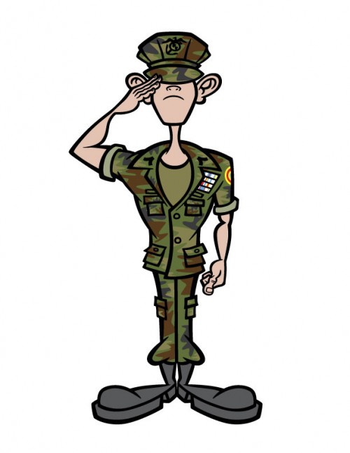
 This cartoon character of a Young Marine was created for a custom t-shirt design for a regional Young Marines troop. I was contacted by the troop leader to create an original character that not only represented an iconic Young Marine, but also had some humor to it.
The client had some specifics that had to be in the artwork—mainly the hat, the uniform and the insignias. With the word “Marines” firmly planted in my mind, I began to work on some rough sketches, the best of which I scanned into Photoshop to begin the refinement process.
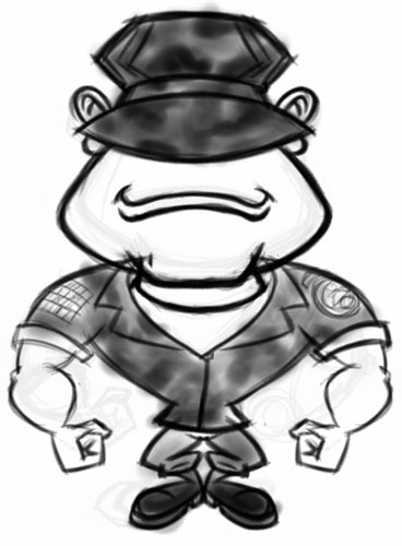 Above is my initial rough sketch sent to the client for feedback. Usually at this stage I like to get some dialog started before I start sketching too much, to make sure I am on the same page as the client. While the client liked the overall direction of the artwork—particularly the hat covering the eyes, he felt it might be a bit too old of a character. The young men in the Young Marines are usually around 12 to 14 years old.
I had envisioned more of the “ideal” Young Marine that perhaps the guys in the troop saw themselves as, but the client rightly wanted to see a younger-looking version of the character.
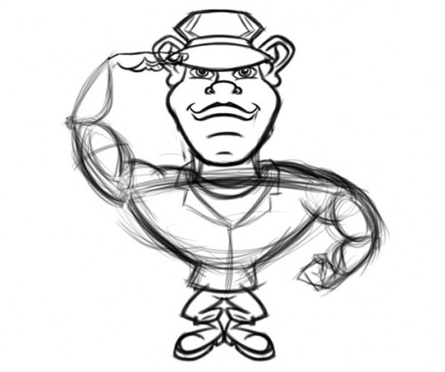 My next sketch (above) was an awkward reworking of the original body with a new, younger-looking face. We also started to emphasize the ears more in this version. Again, the client thought this was better, but still not what he had in mind. we went through a few more variations, but I still was not “getting” the look.
It began to become clear to me that I was fixated on the initial body I had sketched. Going back over some photos of the actual kids in the client’s troop, and clearing my mind as best I could of the existing sketches, I was able very quickly to work up the following all-new character sketch:
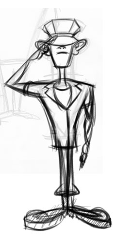 Keep in mind that at this stage, the client was OK with one of the earlier variations I had created. The problem was that I was not satisfied that I had created the right character for this project. The character sketch above was something I went back to work on after getting an OK from a different sketch. However, once I showed this concept he immediately saw what I did and knew this was the guy.
What I think made this version successful was going back to the source photos as opposed to my earlier sketches. Draw from life, or at least the photos.
With the general concept approved and agreed on, I went to work on the details and refinements:
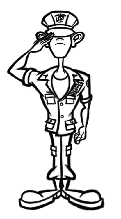 Hat insignia was added, proportions tweaked and details to the uniform were added. I also got a crash course in salutes during this project. If you look closely at saluting hand in the initial rough sketch and compare it to this cleaned up sketch, you’ll see there are slight variations in the angle and positioning. Also the non-saluting hand was fixed to conform to the standards.
Sometimes clients feel sheepish about pointing out all these details, but from my perspective the details are what make the characters perfect. And who better to let me know details like this than the client, who knows their world far more intimately than I do.
With this sketch, the client approved to move to the final color art:
 Being a screenprinted t-shirt design, we needed to keep the colors to as little as possible. Black and a flesh tone were unavoidable. I was as creative as possible with the chest ribbons to make it appear that there were more colors than there actually are, and also re-use the colors from the arm insignia. Since the insignias play such a distinctive role in the look of the uniform, the client insisted they be included. And with a camouflage uniform, I had to work with multiple colors there as well.
On a technical note, I created the camouflage by taking the fill color of the uniform, copying those vector objects to a new layer and then using those shapes as a clipping path. That way I could just freeform create the camouflage pattern shapes without having to worry about where they met the line art.
The final t-shirt design just had some basic text added per the client’s wishes.
All in all, a very fun project and a great client with a great sense of humor. He put up with all of my “civilian” lack of military knowledge with good humor. We were both very pleased with how the final Young Marine cartoon character came out.
Great job! Although as a ‘true’ Marine at any age the bottom hem of the blouse should be aligned.
Thanks! And nice eye. The thought there was that with the salute, it would pull up the shirt a bit.
Great story, top drawings, I wish I could sketch just a bit like you – would make my clumsy t-shirt designing a lot easier…
You are really good at drawing, i like to print your designs off and try and draw them myself! They are so detailed and they are just so….cool! They are different and i like different!
Glad you enjoy the artwork, and thanks for the compliments!
I LUV YOUR DRAWING IT’GOOD ND IT IS MAD :)
Nice job:)
Thanks!