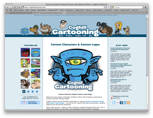
If you haven’t noticed, I’ve done a complete overhaul to my website as well as moving everything over to the CoghillCartooning.com domain. Designed by me, coded by my patient friend John “CJ” Wallace (@vagrantrevival).
A big tip of the hat to: my buddy Greg Newman at 20Seven (@gregnewman) for snazzing up my navigation links and general web Jedi advice, Matheau Dakoske (@matheaud) of Code Line Software for more coding help and general testing, and finally Heather Malarcik (@hkmalarcik) at Malarcik Marketing for proof-reading and spicing up the text content.
In a sense, this new website reflects a milestone for me. More on that later. For now, I want to share some of the background behind the process.
The previous website was created back in 2004. I designed it and then “coded” it in Dreamweaver (back then still owned by Macromedia). At the time it was the third iteration of GeorgeCoghill.com, and that version was created when I made the decision to discard the “jack of all trades, master of none” approach and focus solely on the cartooning and illustration.
I do and have done lots of other types of creative work, many in a non-cartoon style, but some business books I read said to focus on what you love doing and do best, so I had to go with the cartooning — as risky as I thought that was at the time.
Some of the thinking behind the new site:
CSS & PHP
This was the big one for me. I wanted to modernize my code and start using CSS (“Cascading Style Sheets”) as well as “includes” files. As I have fortunately had little time to keep up on web coding as the illustration & design work has remained steady, I turned to long-time friend and web coder John Wallace to help in that arena.
For those unaware, the CSS allows one to style the look of the content separately from the actual structure of the site. There is a reference file that each pages grabs to know what to do visually — for example to colors of links, the CSS buttons in the navigation bars, etc.
PHP “includes” files are a method of building the pages so each distinct “chunk” (header, footer, sidebars, main content) is it’s own separate file, and the each page in the site gets “built” by grabbing these “chunks”. What this allows me to do is to be able to change just one file (say for the footer) and since every page accesses that common file, they all are automatically updated. Magic!
This new site was coded by hand, and while I am not sure what PC software John used on his end, I used Yummy FTP and TextWrangler here on the Mac.
“UPDATABILITY”
My old website ended up a duct-tape mish-mash that was a nightmare to update. I knew little about SEO when I built it, and nothing about CSS. It was relatively easy enough to update the site with new artwork — as long as the thumbnail galleries didn’t need updating as well. My menu/navigation system looked neat-o, but was a major pain to update.
John & I worked out a system based on what I wanted to accomplish functionally, and he let me know what was going to be tough, what was going to conflict with my ideals for the site, and what was good to run with.
The main purpose of the site re-design was to make this mass of code easy to add to & expand, hence CSS and PHP. I also wanted to have the cleanest possible code we could get. I reiterated to John that design would be in service to functionality (which I am sure fried some circuits in his web-coder brain, this coming from an artsy-farsty type!).
PRIORITIES
The driving philosophy behind the design was to showcase the art, and make the site search-engine friendly by way of coding and structure.
My main priorities were:
- Good Google ranking
- Ease of use/navigation
- Focus of the artwork portfolio images
- A design that served all of the above
In the past I would approach website design trying to make something very cool-looking, which ended up being a nightmare to code and subsequently update on a regular basis.
My portfolio site was not updated as much as it should have been for just this reason. As much as I wanted to have a killer design, I know that building a site that I can easily update was far more important. I love the new design, but it’s really more of a frame to the artwork rather than something to be showcased itself.
I also looked not at how I wanted the design to look, but rather how likely I was to maintain the site with regular updates. Existing work leads to new work, so the more work I have on the site the more clients I can connect with. This is far more important than my site looking super-hip.
One snag we ran into was a custom theme for the WordPress blog that would visually integrate with the new website design. Turns out that was a much bigger project than I anticipated, so it has been set aside as Phase Two. Part of my design approach was to make the new site design easily integrated with the 2 or 3 column design of the typical blog, and my existing blog in particular.
MISCELLANEOUS DETAILS
Domain Change: The portfolio website was finally moved over to CoghillCartooning.com domain name, as opposed to the GeorgeCoghill.com domain. GeorgeCoghill.com will live on and eventually be transformed into a portal to my various internet presecnces (portfolio, blog, Flickr, Tumblr, Facebook and the like).
I had been using CoghillCartooning.com as my URL for a while, but until now it was just redirecting to GeorgeCoghill.com until the new site was built.
Manual Labor: Doing this domain switch also required manual htaccess redirects to make sure the old pages pointed to the pages on the new site. The old site had no forethought as to directory structure, so the new site was built from the ground up. The redirects were a necessary evil. In the end it wasn’t as onerous a task as I thought it was going to be.
Stats: Geeked out on Google Analytics so I can get a real metric of how people use the site, what’s working and what I can improve. I also like nerding out on the stats now that they are more accurate.
The Little Stuff: We did some fancy behind-the-scenes stuff to do things like: mask via htaccess the ugly URLs and query strings used for the navigation, granular robots.txt exclusions for images, files and directories I didn’t want showing up to Google and the other search engines, and probably lots of other small things I am forgetting about now.
HEADACHES
Accessibility: Creating a site that is accessible to disabled visitors is also very helpful in search engine optimization. A win-win situation. I took John to task on this with mixed results. One of my must-haves was to load the content visually the way you now see it displayed on the site, but in the code itself have the main section display first, and the secondary stuff like the sidebars, headers & footers display afterwards.The idea here was again to have the content be king, make a site accesible to all users, and to capitalize on the SEO benefits of doing so.
We discovered throughout the process that this was not so easily done in CSS. We found myriads of tutorials giving away the Holy Grail method to accomplish these tasks, only to find they didn’t really work so well in practice, and even these coding gurus weren’t using these techniques in their own code, on their own websites!
IE6: Initially we had a goal of keeping the site so simple it would even render is ancient browsers such as the despised Internet Explorer 6. After countless hours of hair-pulling, I finally did something I should have done at the outset: I checked my Google Analytics stats to see what browsers my visitors were using.Turns out of the 30% of visitors using Internet Explorer, only 15% of those users were on IE6. From that point on, IE6 was out the window.
Perhaps some of our CSS ordering wishlist items might work now that we eliminated IE6 from the testing…
MILESTONE
At the start of this post, I referred to this new website a a milestone of sorts.
Without boring you with the details, the original site I created was in itself a turning point for me as well. By taking the then-perceived risk of focusing solely on the cartooning and illustration work I create, I eventually learned that indeed this was something I could do for a living. As the old story goes, I wish I would have done it ten years earlier.
As the business grew from a freelance thing into the full-fledged business it is today, that website served me well. But it was showing not only it’s age, but was also less and less representative of the work I create. It was again time for change.
Reaching a point in my career where I didn’t have the time to create my own website because the art side of things was keeping me happily busy with illustration work is a 180º reversal from where I was when I first created the original site. And being wise enough to hire an expert instead of trying to do it myself was another milestone of sorts!
For me this new site signifies an new chapter in my art career, and I am looking forward to the next six years bringing a new set of welcome surprises just as the last six years has done.
Enough with my rambling, head over to CoghillCartooning.com and enjoy the new site! And be sure to stop back here and drop me a message in the comments section letting me know what you think.


One thought on “CoghillCartooning.com — Launched!”
Comments are closed.