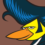
 I just finished up a t-shirt illustration – ‘The Hairy Canary‘ – for mail-order/catalog company What On Earth for their pub t-shirts line.
The basic premise of the t-shirt designs are as follows: the artist is given a choice of bar/pub names to choose from, and from there a design is worked up to go with the name. I believe all the bars & pubs are actual places, but these aren’t officially sanctioned or anything.
From the list I was given, the name ‘Hairy Canary’ just jumped out at me and I knew it was a theme that would spark a cool illustration.
I started out with an initial sketch using the theme I had in mind: a canary with a huge pompadour. Seemed to have good visual comedic potential. I got to work on some rough sketches directly in Photoshop using the Wacom tablet.
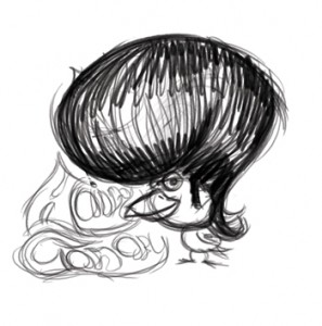 I also as you can see experimented with some custom lettering as well. I liked the exaggeration of the hairstyle, and unifying the lettering with the design in a psychedelic style. But something just wasn’t working for me with this sketch. I set it aside and felt it best to come back to it later.
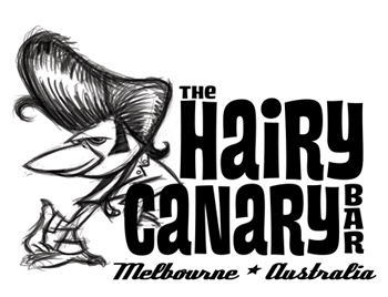
This time around, I sketched on paper instead of directly in Photoshop. For some reason, at least initial sketches always seem to work best on good ol’ paper with a graphite pencil, and then scanned in and cleaned up. While researching images of the pompadour hairstyle, I got the inspiration to go with a 1950’s greaser look for the bird. This gave me much more to work with as far as the pose and the look of the canary character. Now we’re cooking!
From there, it was pretty much just getting an OK from the art director on the sketch (done) and then going into the color vector artwork in Adobe Illustrator. For the most part, it should have been a straightforward digital inking process, but the highlights in the pompadour really gave me grief.
The final artwork was placed on a brown background to match the color of the t-shirt the final artwork will be screenprinted on. There is a limited palette of colors for the t-shirts to be printed on, so I chose a color that I thought would work well with the colors i needed ot use in the printed areas, particularly the yellow and blue.
While I had an upper limit of 7 colors to use for the screenprinting, I always try to limit the palette to the minimum necessary for the design. It cuts down on cost and I believe it also keeps the artwork as tight as possible.
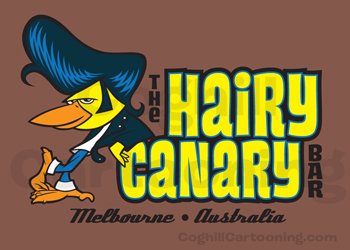
Elvis reincarnated as a canary