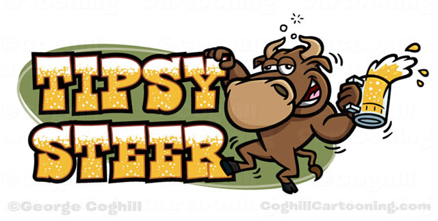
Cartoon logo featuring a drunk bull with a mug of beer. Created for a new restaurant, Tipsy Steer.
The client’s description pretty much emblazoned the look and pose of the bull in my mind’s eye immediately. After the initial sketch, the client asked to see the bull holding on to the logo for balance. This was of course an insight of genius, and was immediately apparent after I sketched it that it needed to stay.
I also created a separate version of the character with his hand out looking for something to grab on to, so the client had standalone art for the character to use without the full logo.
I had to do some digging for the font, and knew I wanted a cartoony but cowboy-looking font. This one was perfect, and the license fee was more than reasonable. The beer bubbles were a last-minute addition, and I wash’t too sure they would work, but as we kept working on the logo both the client and I grew to like them very much.
