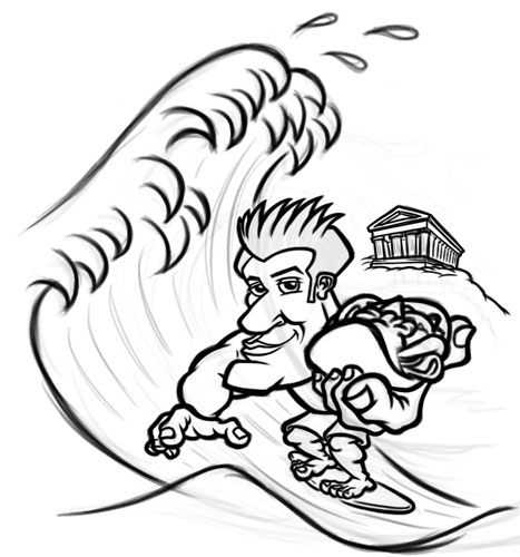
This project was a blast to work on—very cool client and a fun theme How can you beat drawing a surfer dude holding a gyro/souvlaki while surfing a giant wave in front of a Greek temple?
This project came about after the client had commissioned a previous artist to illustrate the logo for “Surfin’ Souvlaki”, which was the client’s new restaurant. The results were less than satisfactory, and after finding me he knew I was the right illustrator for the job.
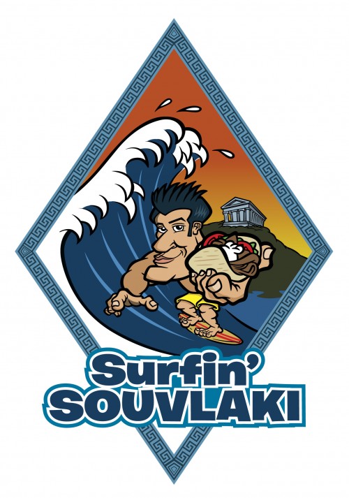
The final artwork was intended for use not only as the restaurant logo, but also for use on the sign on the front of the store. As the client had already purchased a large sheet of diamond-shaped steel, I needed to work up a the illustration to fit within this shape.
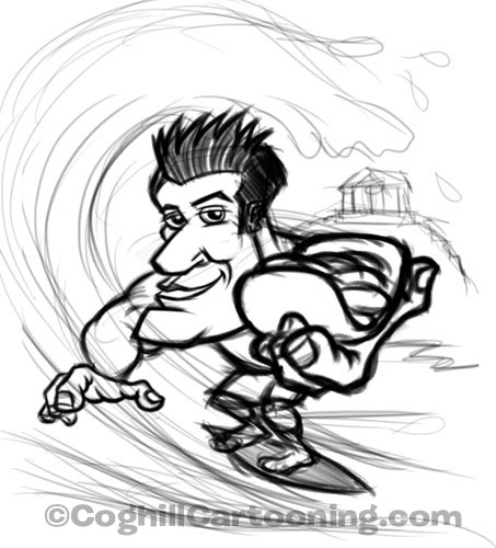
This was one of those projects where I envisioned the artwork pretty much right off the bat. I worked up a rough sketch and then fine tuned the character in a bit more detail as I wanted to flesh him out a bit more when presenting to the client:
The client loved the sketch, and had a few slight modifications. Overall it was good enough to work up the background details and to start fine-tuning the character art:
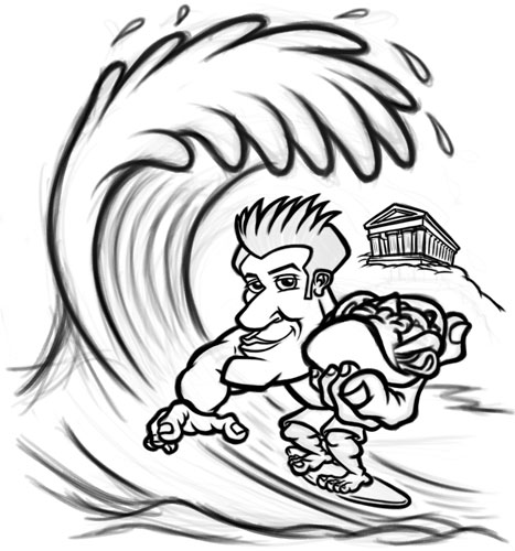
The wave was kind of a pain in the neck to get just right. the rough sketches seemed as if they would just draw themselves, but when I got into finalized them I found them very difficult to get the look I wanted.
After getting some feedback from the client, he mentioned that he would prefer a Japanese-style wave, which ended up being the right way to go and ended up as the final:
Interestingly, one of the toughest things on this project was getting the Greek “key” pattern down for the full storefront sign design. I ended up discovering this online Greek key pattern generator, which I was able to use to create the vector borders in Adobe Illustrator.
Once the final art was hand-created as vector art in Adobe Illustrator, the diamond-shaped frame was created and the illustration was masked. Some slight tweaking of the waves was necessary to make it fir in the final border.
Styled text was created again in Adobe Illustrator, using the Offset Path appearance feature to create the multi-outlined effect.
I really love how everything came together for the final art—the surfer character, the background, the overall sign design, even the gyro! The client was extremely happy with the final art as well.
Check out the Surfin’ Souvlaki cartoon surfer logo on the portfolio.
Love it George. The finer details top it off while not pushing it overboard.
This illustration has made me hungry.
Job done!
Thanks much for the kudos Ken & Greg!
Very nice job George. I actually like the wave in the second sketch better than the Japanese style, but perhaps the size detracted from the character. I like Greek food also, so that helps.
Thanks T Mac. There was something in the wave in the very first rough sketch that I liked, but just couldn’t translate into the final art.