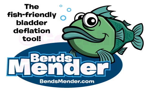
 This was an interesting project. I was contracted to created a cartoon fish mascot character for a niche fishing tool—basically it’s an air bladder deflate gizmo for fishermen so they can sport fish deeper-sea fish and release the expanded air in the fish’s buoyancy air bladder when they arrive at the surface. this allows the fishermen to release the fish back into the water without permanently harming them.
After an initial phone discussion with the client, I was mailed the existing packaging (as I was to also re-design the packaging) as well as some rough sketches drawn by the client to give me an idea of the fish they wanted to see. Typically when clients do send rough drawings, it’s with the “it’s not the greatest” disclaimer, but I actually encourage clients to suck up the ego and send these over. The more information I have from a client about what they have envisioned for the project, the better.
I like to get as much of an understanding of not only what they want created, but also how they envision the final art.
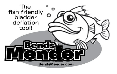
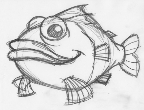
I created a few rough sketch concepts for the fish character, but unfortunately only scanned in the one that I ended up using for the final. I would have liked to have shown the other rough concepts here. As you can see from the rough sketch (above), this guy made it pretty much intact to the final art.
I sent over this rough sketch to the client to make sure I was headed in the right direction and we were on the same page. Client replied with an enthusiastic “yes” and I moved on the clean up and finalize the sketch for the vector art.
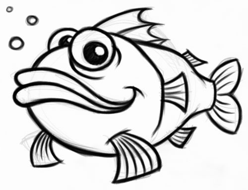
Above you see the cleaned up artwork. As this character was intended to be worked into a full logo with an optional tagline, I placed the cleaned up sketch into Adobe Illustrator so I could work on some grayscale concepts. After many iterations, I settled on the version below and send the mockup over to the client for his OK. Again, he was very pleased with the look and approved everything so I could move to the vector art phase.
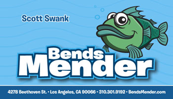
 From there it was just a matter of creating the vector art for the fish and adding color to the existing logo elements already mocked up in Illustrator. As we were working on the color art for the logo, the client realized he needed to get new business cards designed to match the new look of his product. As he wanted to have these ASAP, I created the design of the business cards before completing the packaging design.
Fairly obviously, I went with a blue theme for the design work—it compliments the bluish-green of the fish character nicely, and of course conveys the concept of water/sea/ocean. A slightly alternate of the logo was used for the biz cards—no tagline, and no background oval. I wanted the product name and the fish character to have a floating feel on the card over the dark blue bottom border.
The business cards were designed in Adobe InDesign CS4.
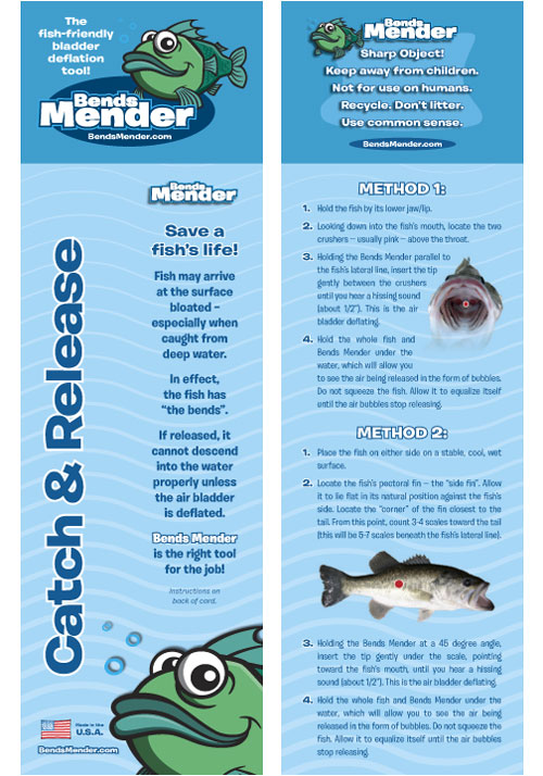
Next, the packaging design. The product very much resembles a ball-point pen, and the packaging is a poly bag with a 2-sided printed insert. A folded “hangtag” (not sure if that is the correct term) would then be stapled over the top opening of the poly bag once the insert and device were inserted.
For reference, I have included the original packaging to compare the re-design to what the client had before:
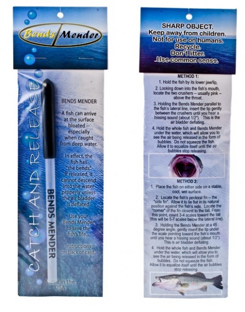 A few things I made sure to tweak were the emphasis on the “Catch & Release” phrase alongside the left-hand side of the packaging. This was important to the client and it was lost in the original packaging. Also, the choice of background imagery in the original was far too distracting for the text overlaid upon it; this was simplified to a graphical representation of waves to let the text speak. I also suggested the addition of the initial text “Save a fish’s life!” since this was what the product does, and was a sort of call to action to the potential customer. I wanted to sum up what the somewhat lengthy description was trying to get across in as basic and short a phrase as possible.
For the detailed instructions on the back, in general the approach was to make the two methods visually distinct, and also clean up the raggedy centered text with justified paragraphs as well as indenting the text from the numbered steps again for more visual clarity. The superfluous boxes behind the images were eliminated—again to give an open, floating feel to the design.
The packaging was aslo design using Adobe InDesign CS4.
The client couldn’t have been more pleased with the final art and design for the entire project, and I too was very satisfied with the final result.
Check out the Bends Mender cartoon fish logo on my portfolio site.
One thought on “Bends Mender”
Comments are closed.