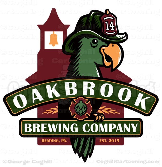
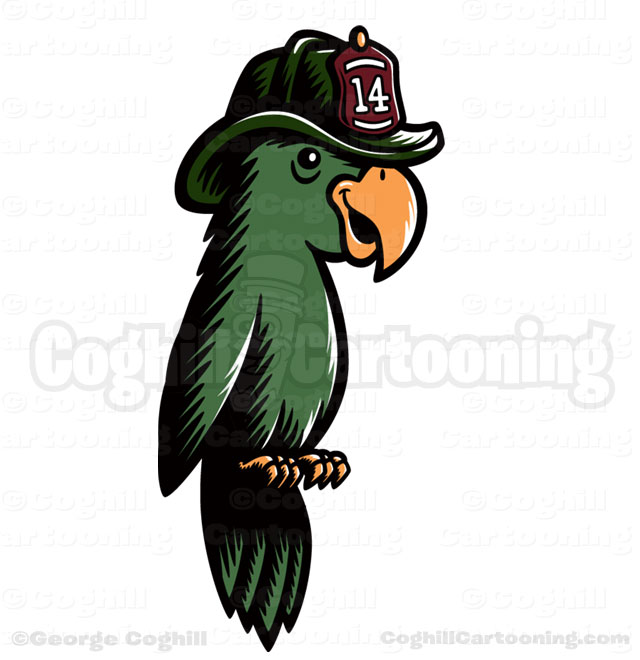
This retro cartoon logo design for the Oakbrook Brewing Company featuring a parrot mascot character wearing a firefighter’s helmet was created for a client establishing a new brew pub in an old converted firehouse/fire station.
The client was looking for a fun, cartoon-style logo that had a classic/retro feel to it. While he couldn’t put it into exact words, I put on my Mind Reader Hat™ and started brainstorming on the direction for the logo.
That was helped along quite a bit by the reference photos supplied by the client. The restoration of the building was going to take cues from the original fire station, including colors, the font on the front sign, and provided the inspiration for the cartoon parrot mascot Polly, who was the mascot of the original firehouse.
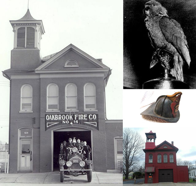
The building itself seems as iconic as Polly, so I knew from the start I wanted to somehow incorporate the firehouse into the logo design. With that deep red of the actual current building, and the green feathers and yellow beak of the parrot, I knew we had a palette that was almost dictating itself. The trick with the green and red was to find the right hues and visual variety and balance so that the logo didn’t come across as “Christmas-y”.
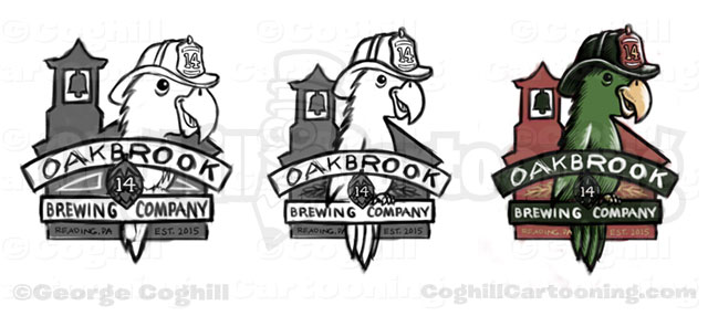
As the rough sketches started bringing the logo into shape, I wanted to see how the colors were going to work in case I needed to allow for changes in the design or illustration so as to make sure all the adjacent and overlapping colors were contesting and distinct where they needed to be.
As you can see in the final logo design, the central hops icon was developed from the sketch stage as a framing design element for the “14” (the original station number) to it’s own central place within the classic firefighter shape, the St. Florian’s Cross. This was a great example of a good client-artist working relationship, where I expressed my needs and intentions for that area (“a shape or element that says “firefighter” but not an object”) and the client, more well-versed in the iconography of the building’s history and subject matter, suggested the St. Florian Cross (whose name I was unaware of prior).
This was the perfect solution, as I wanted something that brought together both “beer” (the hops) and “fire station” (the St. Florian’s Cross). The client was deeply taken with this iconic element, seeing — as I had — the branding opportunities for situations where the full logo wasn’t feasible for using. Bottlecaps were the first thing that came to mind for both myself and the client!
As part of the initial project specs, the client wanted a standalone version of the parrot unobscured by the other logo design elements. This was in itself almost a side project, as I needed to recreate the shading effects from scratch due to the logo design calling for different shading as part of helping to differentiate various areas of the logo, retaining primary attention on the company name.
In the end, not only a logo that exceeded the client’s expectations, but one that I am extra proud of. It was also an absolute pleasure to work with the client on this, we both enjoyed the “historical detective work” associated with developing the concept and solving the various design needs that arose during the development process.
