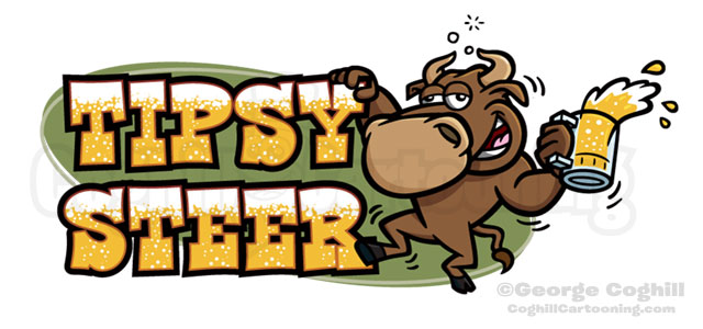
This cartoon logo of a drunken bull for the restaurant “Tipsy Steer” pretty much drew itself in my mind’s eye from the name of the restaurant.
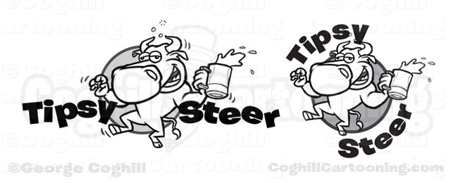
Initially I had the bull cartoon character with his non-beer hand being used to maintain his balance, as seen in the concept sketches below.

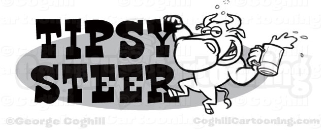
The client wanted to see the bull holding on to the text as an inebriated person might do when stumbling around the bar near closing time, taking a corner a bit too fast.
I sketched up the revised concept, and placed a new font licensed just for this project with a perfect cartoony-cowboy-Old West feel. The client loved it.

We moved on to the color vector art stage for the final logo, and I added in the bubbling beer in the lettering to add to the overall effect of the theme. Note too the wobbly lines around the green background shape in the final logo, intended to add to the drinking theme.
