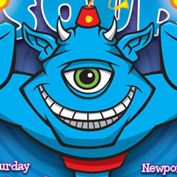
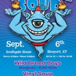
 I recently completed a concert poster design featuring a fez-wearing cartoon genie mascot character for Nashville, Tennessee roots-rock jam band Vinyl Soup.
I have been working with guitarist Andrew Hooker for some time now with t-shirt designs, a logo redesign, concert posters and other promotional materials for the band.
Recent gig poster design work for Vinyl Soup had started to go down a path of design-only work. Andrew initially contacted me for a t-shirt design for the band, and his initial interest was in my cartooning/illustration work.
Starting out on concepts for this poster, I was again working on a solely design-oriented approach, and before I got too far along I dropped Andrew an email to see if going back to an illustrative style would be cool with him. It most certainly was, so I set about to work up a theme for the poster.
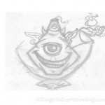 With no real theme for the concert, I decided to browse my collection of inspirational artwork collected over the years from the internet to get myself into ‘concert poster mode’. I was roughly sketching out ideas while watching some TV to occupy part of the brain.
An earlier poster design I created for Vinyl Soup used a psychedelic eye I cribbed from an earlier piece of personal artwork. It looked cool and allowed me to give the poster an illustrative feel even with the tight deadline we had at the time.
I thought for this piece I would go back to the single eyeball theme, and eventually worked up the rough sketch at right. At this point I had no more than a general look for a character, and the fez was just thrown on for fun at the end of sketching.
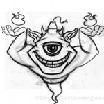 This sketch was scanned into Photoshop, where I then proceeded to clean up some line work, as well as mirror the half-sketch I created and create the full symmetrical character. I knew at the outset that I wanted the symmetry in this to be pretty tight, so I didn’t even bother sketching out the full character, knowing full well that I would just mirror the partial sketch on a new Photoshop layer and then refine from there.
A few things were tweaked at this stage, particularly the angle and size of the arms, as well as the addition of the flames above the genie’s palms.
When duplicating and mirroring the art, I usually reduce the opacity of both layers to about 15%, and then line up the two halves horizontally. Once I have the basic composite Frankensteined together, I will then add a new layer and refine the sketch fresh. This is all done using a Wacom Intuos3 graphics tablet.
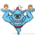 The next step was to add some rough color so when the rough sketch is placed in the working design in InDesign, I can get an idea of how the colors will work together.
Color is added on a separate layer set to Multiply blending mode, and very roughly colored in. Because I needed the art to be transparent in the non-genie areas, I also added a layer mask and converted it to an alpha channel so I could get the transparency to play well with Illustrator and InDesign.
 Â Next, I added the rough genie character color sketch into the working InDesign document. I had already worked out some colors I wanted to use for the poster, and the title text for the poster was created in Illustrator using warp effects to get the arc effect across the top.
 Next, I added the rough genie character color sketch into the working InDesign document. I had already worked out some colors I wanted to use for the poster, and the title text for the poster was created in Illustrator using warp effects to get the arc effect across the top.
The text was saved as an Illustrator file and then placed into InDesign along with the rough sketch of the genie artwork.
This was sent to the client for approval, and Andrew gave it the big thumbs up. Next step was to create the genie as vector art.
Once the vector art was complete, the final genie character was then placed into the working design.
From there, I worked out different details of the overall design, and made some textual changes requested by the client.
I ended up going with a radial pattern for the background lines instead of the original extended starburst, partly because other posters I have designed for Vinyl Soup used the radial starburst, and also because I thought it had a hypnotic wheel/mystical spiral effect that worked well with the genie and the fez.
The flames were added as separate elements so I could add a glow effect to them in InDesign, and some small tweaks were added to the larger text such as outlining and drop shadows to enhance the depth.
The final design was sent to client for approval, and then the press-ready PDF for printing was emailed for printing. The final poster dimensions are 11×17 for a small run gig poster to promote the show.

great sketch n concept of unieyed genie…..