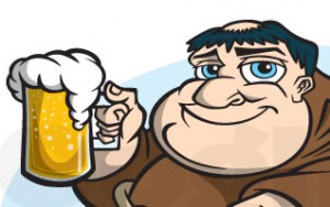
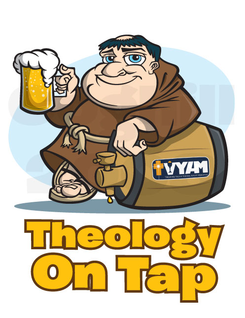
 I recently finished up this ‘Theology On Tap’ cartoon character mascot/logo project for a youth ministries client.
The client is a youth ministries minister, and his new program is focused on bringing discussions of theological matters into more casual settings to try and reach additional young people.
The artwork is intended to be used on various advertising and promotional materials, as well as a t-shirt design.
I thought it odd at first, but I suppose there’s nothing really wrong about talking about religious matters in a bar, right? And I suppose a minister knows the deal. My only concern was to create a great illustration for him and his project.
Anyways, read on for an in-depth overview of the process to create this cartoon character mascot/logo from start to finish, including unused sketches created along the way.
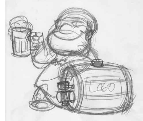
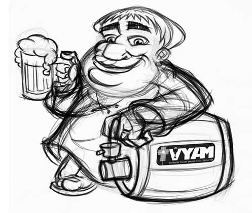
First I worked up a rough sketch of the cartoon monk. Very rough as you can see, I wanted to get the overall flow/rythym of the friar and the keg down, and concentrate on the details later.
Next, I began to work on the details to get an idea of what our monk/friar was going to look like. The layer of the above original sketch (in Photoshop) was knocked down to a 15% opacity, and sketching of the new parts was done on separate layers (the keg, the head, the beer, etc.). I do this so I can erase certain areas of the drawing without needing to be precise, and also so that I can scale and size these elements individually – sometimes the head needs to be sized, or perhaps a prop like the beer keg needs to be juuuust a bit smaller. By drawing on separate layers I can easily tweak things, duplicate just certain parts, etc.
As you can see from this sketch, he looks a bit creepy and this was never sent to the client. In fact, this was one of those ‘time to take a break’ points where I put down the Wacom stylus and worked on something else for a while. I knew it wasn’t working and needed to come back to it with fresh eyes.
When I came back to the art (I believe it was the next day), I grouped all the layers of the above sketch into a new Layer Group in Photoshop, turned off the ‘head’ layer, and then again reduced the opacity to about 15-20%. I started working on a new head, as well as tightening up some of the other elements which I thought in general were working.
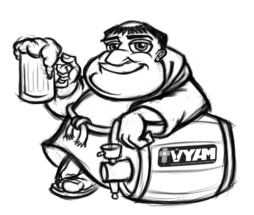 Here our monk/friar is looking much more jovial and friendly (and maybe even a little buzzed!). The proportion of the head is also much better than the previous attempt. At this stage, I usually have a ‘cleanup’ layer above the working sketch layer(s), and here I will even add white marks in addition to the black marks to clean up, so I don’t have to go back and hunt down which layer certain elements are on in order to erase them.
The client gave the big thumbs up at this stage with some very minor tweaks. this was the first (and only) concept sketch he saw. I like to really work through an idea so that when I present something to a client, it’s an accurate depiction of how it’s going to look. I don’t rely on the client ‘getting it’ from a rough sketch. In some cases you do need to work out various quick rough sketches, but I talk through the wants and needs of the client via email and phone before going to the sketch stage, and usually have a pretty good idea of whatI am going to work up by the time I sketch.
Sometimes I will even verbally describe what I plan on drawing; this feedback also helps avoid doing too much (or any) work in a direction undesirable to the client.
The next step was to place this finished rough sketch into Adobe Illustrator as a template, create the vector art paths, then add color & shading. The final step was to add some simple lettering. A slight tweak to the color shade of the beer keg, and the final art was complete.
I did go back and tweak the beer mug to improve it after getting the OK from the client. I don’t consider a project ‘done’ until I personally believe it reflects my best work. The previous version of the beer mug isn’t all that different, but slight changes to the highlights and shading made it perfect.
George We are a licensed Theology on Tap in Minneapolis. It the logo you did available for our use?
Thomas: I emailed you about this.
Hi George
I like a lot the monk with the beer, i have a bar,pub named “Frailes”, can you made some logo for us. can you send to me the cost of this?
I wold like almost the same, but not with a barrel, i like more
a coat armor.
Thanks
Hector
Hi George
I like the image of the monk with the beer and would like to use it for a brew apron design.
How can I get a copy with out the label on the barrel
Thanks
Dave
Hi Dave,
Thanks for contacting me on this image. Unfortunately that character was created for another client and is not available for licensing.
I’d be glad to discuss the creation of an original character for you if that interests you. If so, it would be very helpful for me if you could fill out my Quote Request form so I can understand your project better: http://coghillcartooning.com/cartooning/info/quote